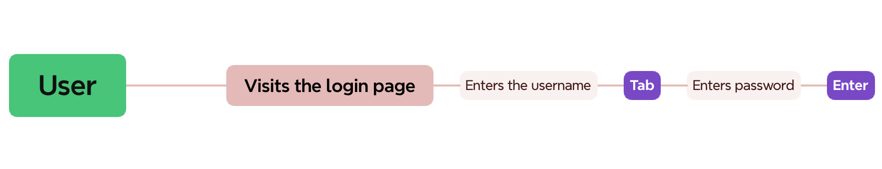
Login Pages
When a user visits the login page, they might start typing their username or email address out of habit. If the page isn't well-designed, it might not accept this information or, even worse, place it in the wrong field, leading to a poor user experience.
| Example | Description |
|---|---|
| Bad Login Page #1 | The user's keyboard entries aren't accepted at all. This means the user has to click on the input field or press the tab key to focus on it manually. |
| Bad Login Page #2 | When the user types their email address, it gets accepted by the newsletter subscription form instead of the login form. This creates a frustrating experience. |
| Bad Login Page #3 | When the user types their email address, it's accepted by the login form. The user then presses the Tab key before entering the password. Unfortunately, the app focuses on the newsletter subscription field instead of the password field. The user starts typing their password into the newsletter subscription form |
| Bad Login Page #4 | After entering the password and pressing the Enter key, the form doesn't submit. The user needs to click the submit button manually to complete the process. |
| Bad Login Page #5 | The username is treated like public-information. Usernames or email addresses are sensitive information, but we only hide the password and not the username. |
| Good Login Page |
Seamless user experience:
|